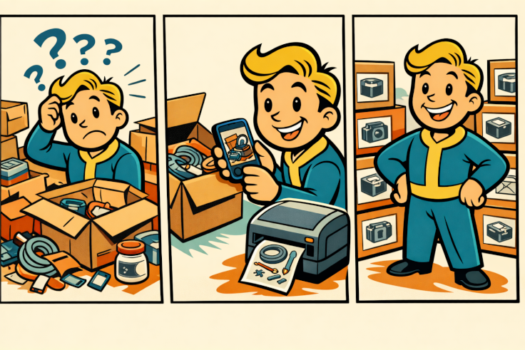
I bought my Bangle.js 2 a few years ago. Open hardware, JavaScript on your wrist, full control over every pixel, and a passive color display that stays visible all the time — it all sounded great. And yet, for several years, the watch mostly remained just a regular watch, because I never quite found the time to properly dig into the code.
The trigger turned out to be something very simple: the weather got hot, and I wanted to see the temperature from my Home Assistant right on my wrist. Just one small widget. That was enough to pull on a thread that eventually unraveled into a complete custom watch face.
Getting Data onto the Watch
The Bangle.js 2 does not have built-in Wi-Fi — it connects to the phone over Bluetooth. So I used an existing bridge: Bangle.js Gadgetbridge, an app that keeps a persistent connection to the watch and supports the com.banglejs.uart.tx intent. This intent lets you execute arbitrary JavaScript directly on the watch.
The flow looks like this:
Home Assistant (every 5 minutes)
   → broadcast intent com.banglejs.uart.tx
     with payload: HATEMP.set('22')
   → Bangle.js Gadgetbridge
   → code executed on the watch
On the Home Assistant side, all I needed was the Companion app and the command_broadcast_intent command, triggered by an automation every five minutes.
There are two pitfalls worth knowing about. First, the Companion command requires the intent_package_name field. Without it, the intent lands as a regular notification: something appears on the phone, but the watch stays silent. Second, the “Allow Intents” option has to be enabled in the device settings, because it is disabled by default.
A Widget That Ages Gracefully
I started with the smallest possible thing: a widget in the top bar. I store the temperature value in a global HATEMP object, so the Home Assistant intent can update it regardless of what is currently displayed on the screen.
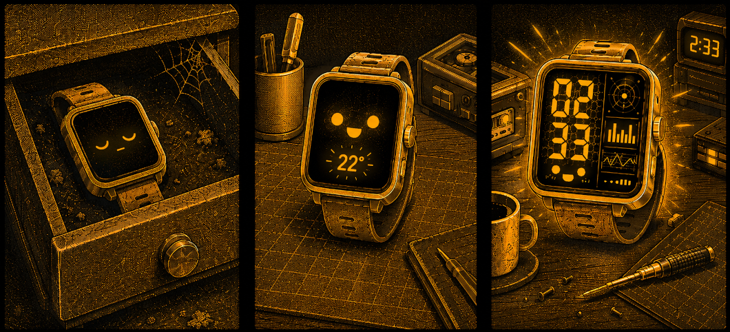
But a number alone is not enough. A temperature reading from two hours ago would look exactly the same as a fresh one. So I added age-based data degradation: a fresh reading is large and easy to read; after ten minutes, the font gets smaller; after twenty minutes, a counter appears showing how many minutes have passed since the last update; and after two hours, the widget goes back to “–”. The counter refreshes every minute, even when no new data arrives.
That was the moment when I still had no idea I was going much deeper than planned.
A Custom Watch Face
Once the temperature part was solved, the next natural step was a full watch face. I wanted the Home Assistant reading to become a proper part of the design, not just a number attached to the status bar.
The mood: cassette futurism meets cyberpunk — warm amber on black, geometric frames, something halfway between 1980s audio equipment and a terminal from a sci-fi game.
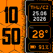
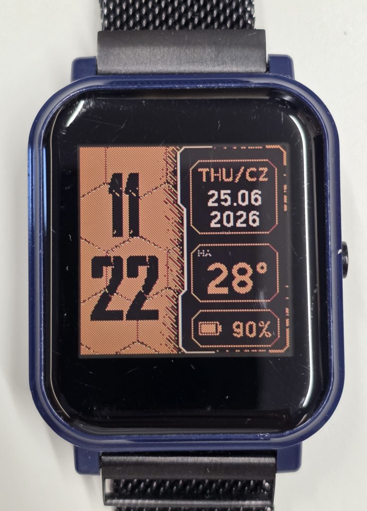
The layout is simple but expressive: on the left, large hour digits stacked above the minutes, placed over an orange honeycomb background. On the right, a black panel with a bilingual weekday, date with year, Home Assistant temperature, and battery level.
Rich Graphics on a Limited Screen
The display is 176×176 pixels and only has 3-bit color — no gradients, no soft transitions. That forced two important design decisions.
Shading through dithering.
To create the impression that the black panel sits on top of the hexagons and casts a shadow, I used raster-style dot shading. The dots are densest near the panel edge and gradually fade away from it — similar to the way old monochrome G-Shock displays create visual texture. On the actual screen, it looks even better than in the preview.
Pre-rendering the background.
The hexagons, bevels, shadow, and frame are generated once and then stored in memory as an image. Every minute, the watch only draws the dynamic data on top: time, date, temperature, and battery level. That way, the expensive graphics are computed once, not thousands of times a day.
Obsessing over the Details
The thing that took the most time was something I had not planned at all: the panel edge. The dividing line went through several versions — from a straight line, to an arc, to a geometric profile with 45-degree cuts. Later came beveled corners, orange lines fading into a cyberpunk-style glitch pattern, and vertical elements closing the frame.
Every detail meant another iteration: look, move it by two pixels, judge, repeat. It was excessive, but that is exactly the kind of thing that pulls me in. Sometimes it is hard to stop until it feels exactly right. And sometimes it is 2:33 in the morning, and common sense finally suggests that it may be time to rest.
The Font That Made the Difference
The default fonts simply did not fit this aesthetic. I needed something rougher, more technical, and more post-apocalyptic. I found CRACKWALL — a cracked stencil font that immediately clicked with the rest of the design.
Espruino does not render TTF files directly, so the font has to be converted into a bitmap. My first manual conversion produced blurry digits, because one-bit thresholding destroyed the cracked edges. The solution was the official Espruino converter with 2 bits per pixel, giving the font a simple form of antialiasing.
Then came the sizing dance. A font generated too large and scaled down looked soft. Only the version generated natively at the target size produced sharp digits with the right amount of spacing around the characters.
Where It Stands Now
I now have three elements using the same global HATEMP: a full-screen app, a widget, and the hexclock watch face. One Home Assistant configuration feeds them all.
The watch face shows the time in a cracked font over a hexagon background, a bilingual weekday, the date with year, temperature, and battery level. The whole composition is tied together with a HUD-style frame and amber details on a black background.
I also added a subtle indicator for stale data: small dots above the temperature. The longer it has been since the last update, the more dots appear. It is a quiet visual cue that separates “this was updated a moment ago” from “this has not refreshed in a while.”
Reflection
The most interesting part is how a tiny spark — wanting to see one number on my wrist — brought back a project that had been sitting idle for years. All it took was one concrete, tangible goal to sit down and start. Then each step naturally led to the next: the widget led to the watch face, the watch face led to refining the frames, and the frames led to finding the right font.
Sometimes you do not need a grand burst of motivation to bring an old project back to life. One small detail you genuinely want to see finished can be enough.
There is still more to tinker with: diagonal lines to break up the symmetry of the frames, saving the last known temperature so it survives a restart, maybe a few more micro-details. But that is a story for another post.

Recent Comments